1) Step 1- Problem or
Opportunity Statement
A BI dashboard is a tool that transforms information and displays Key Performance Indicators (KPI)
and metrics to assess organizational performance. BI systems are capable of
consolidating very complex data from internal or external third parties, which
uses different applications to centralize the information and convert it into
actionable data. This data compares to other metrics and performance
indicators.
Business
Intelligence dashboard is a powerful tool to elaborate dashboard with big data.
It is also more useful for the dashboard to project managers, project
directors, and executive managers.
Can Business
Intelligence’s applications provide efficiency of use of resources, the
stability of administration of the information, scalability to share
spreadsheets or data, and avoid indifference from managers of watching the
reports generated?
In
Post W19_Dashboard with Business Intelligence 2, a dashboard for Oil and Gas
Projects can also be elaborated with BI Platforms.
The author has perceived that for elaborating a dashboard, the data source needs to prepare differently among BI platforms. It cannot be the same for all the charts we want to use for each BI platform.
There are other differentiators than can be analyzed to determine other advantages of BI platforms compare to MS Excel.
What other
advantages of making a dashboard with Business Intelligence platforms compare
to other reporting software?
Let’s determine the
advantages of Business Intelligence over other report software.
2) Step 2 – Feasible
Alternatives
For reporting, we will
compare
1.
Business Intelligence Software
a.
Power BI Desktop
b.
IBM Cognos Online
c.
Dundas BI Online
2.
MS Excel
3) Step 3- Develop the
outcomes for each alternative
We can get the
following reports in the form of dashboards or tables from each platform as follows:
1.
Business Intelligence Software
Based on the following list of charts:
·
Area charts: Basic (Layered) and Stacked
·
Bar and column charts
·
Cards: Single number
·
Cards: Multi-row
·
Combo charts
·
Doughnut charts
·
Funnel charts
·
Gauge charts
·
Key influencers chart
·
KPIs
·
Line charts
·
Maps: Basic maps
·
Maps: ArcGIS maps
·
Maps: Filled maps (Choropleth)
·
Maps: Shape maps
·
Matrix
·
Pie charts
·
Ribbon chart
·
Scatter, bubble, and dot plot charts
·
Scatter-high density
·
Slicers
·
Standalone images
·
Tables
·
Treemaps
·
Waterfall charts
Based on the following list of charts:
·
Column Charts
·
Line Charts
·
Pie Charts
·
Bar Charts
·
Area Charts
·
Point Charts
·
Combination Charts
·
Scatter Charts
·
Bubble Charts
·
Quadrant Charts
·
Bullet Charts
·
Gauge Charts
·
Pareto Charts
·
Progressive Column Charts
· Micro charts
·
Marimekko Charts
·
Radar Charts
·
Polar Charts
·
Range Indicator Charts
Based on the following list of charts:
·
Data Bar Table
·
Table
·
Calculate Box Plot
·
Parallel Coordinates
·
Treemap
·
Add Trend Line
·
Bar
·
Stacked Bar
·
Line
·
Point
·
Pie
·
Scatter Plot
·
Pie/Sunburst
·
Waterfall
·
Radar Charts
·
Gauges
4) Step 4- Selection of
the acceptable criteria.
In
W19_Dashboard with Business Intelligence 2, we have used suggested metrics made
by Stephen J.C. Paterson. He also mentions that NDIA offers other metrics that
can be reported such as:
1. Schedule
a. SPIt
vs TSPIed: A comparison of past and future schedule efficiency
The chart should be similar to the chart
of CPI vs TCPIeac. See below.
2. Cost
a. CPI
vs TCPIeac: Forecast Efficiency Rate
3. Staffing
a. Staffing
Profile: A time-phased, 12 months rolling
full -time equivalent (FTE) headcount by-product, organizational, or functional
area of individuals required on the program
b. Critical
Skills Key Personnel "Churn"/Dilution Metrics: Project Team members
are considered a Critical Skill if the loss of those individuals would directly
or indirectly impact program technical requirements, compliance, cost or
schedule performance, customer commitments, or program deliverables.
c. Critical
Resource Multiplexing Metric: % of personnel dedicated to the program vs the %
that is spread across multiple programs.
4. Risk and Opportunity
a. Risk
and Opportunity $ vs Management Reserve $: Visual gauge of the rate at which MR
is being expended against the estimated risk exposure on a project
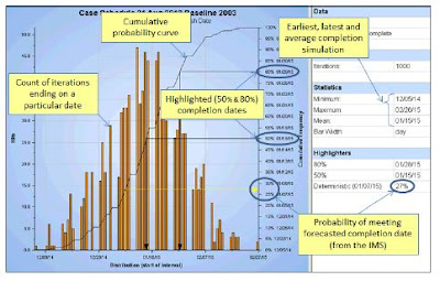
b. SRA
Histogram (Frequence Distribution Graph): Calculates the probability of
achieving a specific scheduled completion date
c. Sra
Sensitivity (Tornado) Graphs: Used to identify the activities most likely
to drive the outcomes
d. Schedule
Margin Burn-down: A tangible representation of the time associated with the
risks to an end-item deliverable or contract event
5. Requirements
a. Requirements
completeness: Indicates progress in
eliciting and documenting all the requirements necessary for final, completed
system design. It compares planned completion with the actual completion
c. TBD/TDR
Burn Down: "To-Be-Determined" (TBD) or "To-Be-Resolved"
(TBR) refers to the system, subsystem, or product requirements that have not
been finalized, as listed or specified in the requirements documents or models
d. Requirements
Traceability: A measure that determines how accurately a program's requirements
are maturing to support a baseline solution at various Acquisition Phases
6. Technical Performance Measures
a. Technical
Performance Measure Compliance: Involves predicting the future values of a key
technical performance parameter of the high-level end product under development
based on current assessments of products lower in the system structure.
7. Contract Health
a. Contract
Mods: The trending contract modifications which help predict the accuracy of
the Performance Measurement Baseline (PMB) and ensures that the contract was
written correctly
b. Baseline
Revisions: Indicates lack of control to the PMB in the near term is when the
percent change of baseline dollars approaches 6% or more. This metric, similar
to contract modifications, helps to validate the integrity of the PMB.
d. Program
Funding Status: Actual and projected cumulative program funding compared to
projected program expenditures plus potential termination liability
e. Research,
Development, Test, and Evaluation - Actual Billings vs Forecast Billings: Measures
how well the contractor is performing against forecast or planned billings
8. Supply Chain
a. Parts
Demand Fulfillment: Tied to On-Time Delivery (OTD), the percent measurement of
total items received at the agreed-upon Due Date.
b. Supplier
Acceptance Rate: The percentage of acceptable versus rejected delivered parts
in a month for approved suppliers
c. Supplier
Late Starts: A Supplier Late Starts is any course of events that prevent a
supplier from being able to begin manufacturing
the items on a Purchase Order
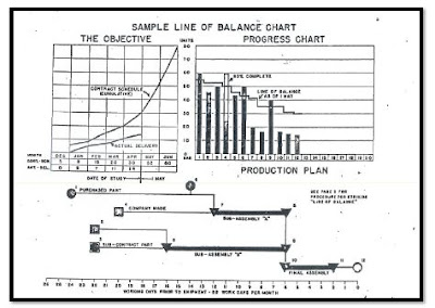
d. Production
Line of Balance: Means of integrating the flow of materials and components into
the manufacture of end items in accordance with time-phased delivery
requirements
9. Other
a. Rayleigh
Estimator: A nonlinear function used to model cumulative cost accrual in
research and development (R&D) contracts.
We
are going to find out if Bi Platforms can elaborate or report those kinds of
indicators.
5) Step 5- Compare the
outcomes from each alternative analysis done in Step 3 against the minimum
acceptable criteria from Step 4.
It
is necessary to elaborate a database to create all those charts in any BI
Platform. The author has used the same information shown in the images inserted
above.
The database can be shared to download if the reader wants to practice the elaboration of the same
charts on a different platform. Send an email to the author to piero.anticona@gmail.com The dashboards elaborated by the different platforms are as follows:
1.
Business Intelligence Software
a.
Power BI Desktop
b.
IBM Cognos Online
 |
| IBM Cognos - Dashboard 1 |
 |
| IBM Cognos - Dashboard 2 |
 |
| IBM Cognos - Dashboard 3 |
 |
| IBM Cognos - Dashboard 4 |
c. Dundas BI Online
2.
MS Excel
Most of the metrics listed in Step
4 are made with MS Excel.Most of the metrics listed in Step
4 are made with MS Excel.
As a result, we can
summarize in the table below what metrics have been replicated. The author has considered three colors:
Green: If the chart contains the same information as the example (except for the title of the chart)
Yellow: If some lines, curves, bars, axis, and other information is missing.
Red: It can not be replicated.
Green: If the chart contains the same information as the example (except for the title of the chart)
Yellow: If some lines, curves, bars, axis, and other information is missing.
Red: It can not be replicated.
6) Step 6- Selection of
the “best”.
As shown in the table above, not all the metrics can be replicated with a BI platform.
The best BI Platform that can replicate most of the charts is Dundas BI.
Maybe a better knowledge of each BI Platform might help to include or add more information missing for the yellow metrics. We also have to consider that two BI platforms were trial versions. So, some features might be restricted or might be available only for a fully downloaded version.
It seems that for these unique metrics, MS Excel is still the best platform to elaborate on them. It offers better flexibility and a more intuitive way to elaborate charts.
7) Step 7- How to plan
on tracking/reporting on recommended choice.
As
shown in this post, other metrics suggested by NDIA can not be replicated as MS Excel does it.
It was not easy for the author to intuitively determine how to elaborate on the charts.
It was not easy for the author to intuitively determine how to elaborate on the charts.
It might be necessary to analyze if there is another way to report the same information based on what the BI platform can elaborate on.
8) REFERENCES.
1. Durcevic, S. (2019, July
24). 10 Business Intelligence Dashboard Best Practices In The Digital Age.
Retrieved August 28, 2019, from https://www.datapine.com/blog/bi-dashboard-best-practices/
2. Conrad, A. (2018,
November). Top Business Intelligence Requirements & Checklist Template for
2019. Retrieved August 28, 2019, from https://selecthub.com/business-intelligence/top-business-intelligence-requirements/
3. Spicer, T.
(2019, March 22). The Definitive 10-Point Scorecard Before Choosing a BI
Solution - DZone Big Data. Retrieved August 28, 2019, from https://dzone.com/articles/the-definitive-10-point-checklist-before-arriving
4. Microsoft.
(2019, August 20). Visual types in Power BI. Retrieved September 7, 2019, from https://docs.microsoft.com/en-us/power-bi/consumer/end-user-visual-type
5. Paterson, S.
(2017, October). Best in Class – Dashboards for Oil and Gas Projects. Retrieved
September 27, 2019, from https://pmworldlibrary.net/wp-content/uploads/2017/10/pmwj63-Oct2017-Paterson-Best-in-Class-Dashboards-for-OG-Projects.pdf
6. National
Defense Industrial Association. (2017, September 12). A Guide to Managing
Programs Using Predictive Measures. Retrieved October 1, 2019, from https://www.ndia.org/-/media/sites/ndia/divisions/ipmd/ndia-ipmd-predictivemeasuresguide-rev-2-july312017.ashx?la=en


